Communication Design 2
Project: Cross-Media Translation
Assignment
Select what you would consider excellent poster design and develop a deep and informed critique about your selection. You will be assigned a second, different media type (exhibition design). Create a new piece within your second medium for an audience that has not seen your original. You will need to translate the original to the new medium as well as contextualize it within your own critical commentary.
Watch the Video!
Process
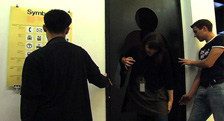
In 1975 the original Symbol Signs were established in direct response to a European initiative that aimed to create a unified set of symbols with a single graphic vocabulary. These symbols would be distributed throughout the United State and the rest of the world using a variety a method to encourage the widest possible usage by designers and commercial interests.
Traditionally, posters function as a tool for promotion. In creating a cross-media translation of this poster, I have hyperbolized the size and inverted the traditional use value of the male/female bathroom symbol. It my intention that visitors to this exhibit will not only reconsider their daily interactions with symbol signs but the traditional ways in which they are employed including their role in the homogenization of society, cultural colonialism and paternalism.
What I Learned
One of the larger themes I found throughout this semester was the necessity for finding an entry point into my assignments. As Anne pointed out in class, there will be some work you do after graduate school that may not resonate with your artistic sensibility. We all have to pay the bills. But as designers we have to identify our "entry point" for making the working exciting, interesting and challenging as means of making the work personal- and thus of a higher quality.
For the designer, this process begins with the identification of values, expectations and developing a critical voice. Much of this class was devoted to understanding what do we, as individuals, bring to the table as designers.
In this assignment, the importance of research was once again hammered home. By taking a step back and understanding how our our fits into a historical and cultural moment can strengthen a piece. Moreover, what are the affordances of the media for which we are designing.
And while there were many lessons, realized or not, during this term, the larger themes that emerged were:
Once again, making things with my hands is an invaluable lesson.
It is essential to consider the tone you want to convey when presenting your work.
There is something beautiful in making a single, swift and direct move with your work.
Class Quotes and Notes
We all have stuff to draw on.
You don't have the be all and end all to held a position.
Like all points of view, it is subject to change.
Write with the courage of your convictions.
Be attentive to how you hang your work.
Even cliches have their place.
The point of these exercises is tat you are language designers not typographers.
The more sophisticated you become, the more your focus narrow.
Recommendations
Ellen Lumpton = Thinking with Type
Frame Magazine.
La Jefee
No Vum
Visual Communication
Make
I Magazine
Wired
Art Forum
Cabinet
Metropolis
Project: Macro/Micro
+
Assignment
The assignment is to create a series of print page layouts that include both the original text (macro) and your written response (micro). The graphical arrangement should be designed in tandem with the writing and the two should be mutually supportive of one another. Your written response should be between 500-3000 words
View the Work
Process
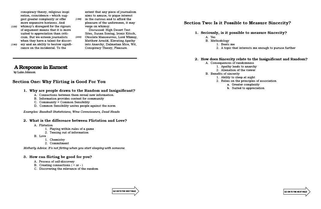
Charlotte Taylor's article "The Importance of Being Earnest" was given to me by a close friend nearly four years ago and is a piece that I have continually returned to throughout my brief career in design. In particular, I am drawn to Taylor's take on the small role that sincerity has cutout in a ironic and cynical society.
What I discovered in writing my response to this piece was that understanding the role of sincerity was greater than the scope of this class. Nonetheless it was an idea that was interesting to pursue further. Moving my perspective from the expert to the curious was difficult but important move for me as a designer because it made me let go of my preconceived notion of what being a designer is all about.
The second move in this process was finding an entry point for my response. Due to the difficulty of the text, I wanted to find a way to make Taylor's writing more accessible to the first time reader. Using my support system, it was pointed out to me that my response was beginning to resemble the format employed by the SAT's. And while I finally located my entry point, my initial response to directly mimicked this style was a move that fell back on bad design habits from my past.
Again, good critique showed me that I need to identify elements of design and to carefully pick and choose specific elements to incorporate into my own unique style. Lesson learned and earned!
What I Learned
What I found particularly interesting was that this voice does not need to be one of authority. Rather, this voice can be one of curiosity, agreement or opposition. What resonates with me is this position must come from the gut. There is something refreshing in saying "I don't know" or "This is an idea that is interesting enough to pursue further" and pursuing an answer artistically.
And while there were many lessons, realized or not, during this term, the larger themes that emerged were:
My work tends to appropriate larger, kitschy themes. Instead of a literal translation, I need to pick and choose elements from these works and make them my own. Bold gestures!
The representational and operational need balance.
Typography is a tool for reading. Get into that reading.