Approach
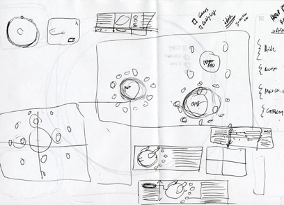
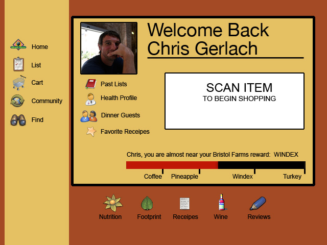
After defining our target audience, our task was to develop an interface. To this end, the design team went through various iterations before arriving at their final design.
Aesthetic
- The overall neutral color tone was chosen to promote a clear, clean feel as well as prevent excessive fingerprint marks left by multiple users.
- The bright colors assigned to the Widgets encourage quick reads of the information.
- Product images were large and centered to reinforce a product-focused design.
- The Bristol Farms logo was redone to complement the look and feel of the touch screen technology.
- The typeface Din was chosen not only for its quick, clean read but because it matched an aesthetic of self-awareness found at Bristol Farms.
Interface
- Using the affordances provided by current touch screen technologies, users can customize the interface by moving objects to fit their needs.
- Critical feedback convinced us to display the shopping list prominently on the left.
- Widgets, placed on the right hand side, were color coded with large statistics to promote a quick read of information.
Production
- Implementing our field research, a physical model of the interface was constructed.
- By constructing a physical model, we were able to test the sizes of our images and fonts as well as make ergonomic considerations for potential users.

