|
|
|
|
|||||||||
|
|
|
|
|
|
||||||||
|
|
|
|||||||||||
|
|
|
|
||||||||||
|
|
 |
|
 |
|
|
|||||||
|
|
|
|||||||||||
|
|
|
|
||||||||||
| For our research we drove the Toyota Prius and a higher-end Toyota hybrid, the Camry. We took photos and videos of the digital interface while in transit and while stopped, interviewed the sales representative about the different features/options available for each cars, and researched various Prius online communities. |
|
|||||||||||
|
|
|
|
|
|||||||||
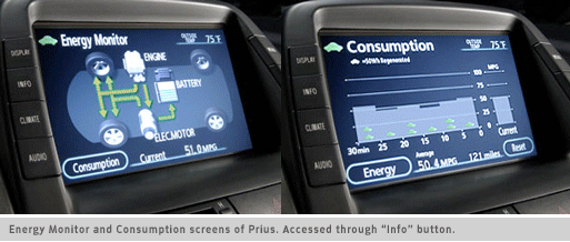
- We discovered an active (compulsive) community of Prius owners (interested in sharing notes about the Prius and other green related topics, competing for the best overall MPG number, and having get-togethers every so often) - The “Energy Monitor” screen, showing the hybrid system in use, was the default screen while the car was in use. It functioned as both education and entertainment.
- From the “Energy Monitor” a user could press the touch button titled “Consumption” to arrive at the screen showing the overall trip information including MPG and total miles traveled. - On the outside of the LCD display there were buttons which would change the content shown on the display. They were titled Display, Info (included energy screens), Climate, Audio, Phone, Dest and Map.
Criticisms of Current Design - Too many clicks: While we liked the real-time information of the hybrid system being shown on the screen, we didn’t like having to go to a second screen to see our overall trip information - Language didn’t support the brand: We didn’t like the Overall trip information being titled “consumption”. We thought there could be a more positive name such as “Efficiency” which encouraged the saving of energy rather than the consumption of it - Touch-screen not always the best option: Functions like radio and climate control, which were included in the LCD display as a touch-screen interface, became more difficult to use while driving than the more traditional knobs for radio and AC.
|
|
|||||||||||
| DesignTeam:
Hannah Regier, Amy Sheppard Interaction Design 2 + View prototype + View screens |
|
|||||||||||
|
|
|
|||||||||||
|
|
|
|||||||||||
 |
|
|||||||||||
|
|
|
|||||||||||
 |
|
|||||||||||
|
|
|
|
|
|
|
|
|
|
|
|
|
|