Google has created an intersting branding issue for itself. After useing its bold, rainbow colored log for so many years, they have built strong brand recognition. However, the strong recognition is built around a fundemtaly bad logo design. In redesigning google's overall look we felt that we must acknowledge their history but must also push the design forward into somthing more elegant.
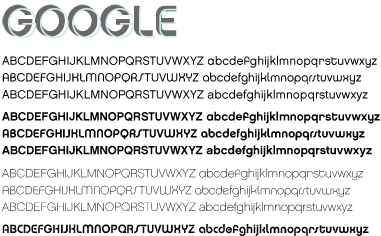
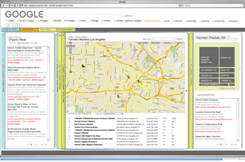
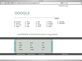
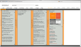
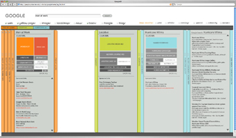
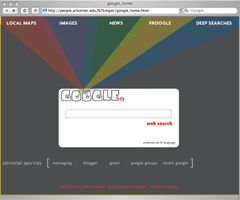
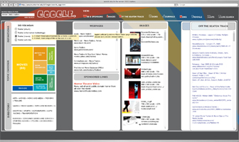
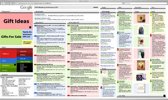
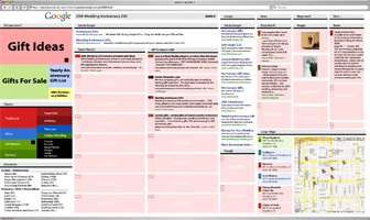
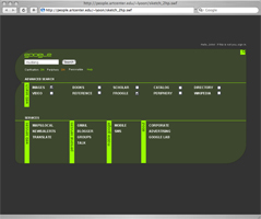
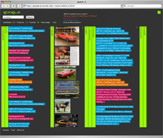
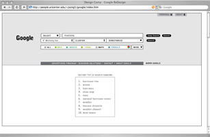
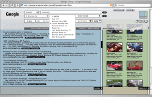
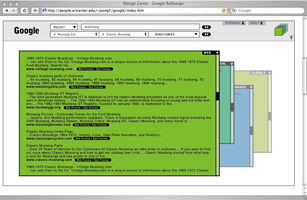
Our sollution is multipart. First we are using color in a very coded way on the search results page to identify what cards belong to what search. This means that we needed to reduce the amount of color used elswhere in the design. Our sollution was to make the results page controls grey, while haveing the home page monocrome. Not wanting to complety disassociate with google's established image the homepage changes colors every time it is loaded, thus keeping with its rainbow past. Secondly, we are updating the logo font and other fonts used to Chalet, a clean, contemporary san-serif font.
Font samples:
Color Samples:

Final Comps:
Final prototype site
Prototype Comps:
Final prototype site
First Round:
Hannah
people.artcenter.edu/~regier/google_home
Peter
Peter's Comp Launch Site
Linda
Home Page
Search Result
Jiyeon
Jiyeon's Comp Launch Site
Home Page
Search Pages
New Web Site
|