Twitter Redesign
The intention of my redesign address issues of hierarchy, visualizing data and projected output/inpt applications.
Assignment
Using an existing soical networking site or one that has yet to be invented, design new insights that consolidate information and reducing redundancies in information.
About Twitter
The social networking site Twitter allows "friends, family and co-workers to communicate and stay connected through the exchange of quick, frequent answers to one simple question: What are you doing?"
After mapping all the components of the current site such as actions, functions and content, it became apparent that there were four data components driving the current interaction: the user, the content (message), time and the input device. I also observed that the hierarchy placed an equal value on both content and the user throughout the site.
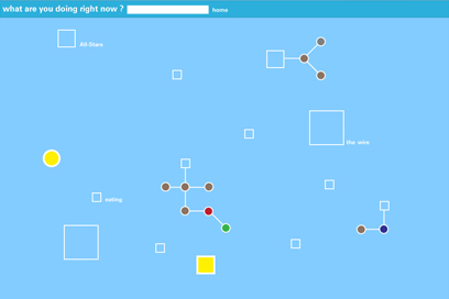
By emphasizing the shared content currently available, my redesign introduces Twitter users to the possibility of serendipity and inspiration between messages. Moreover, it aims to expand the users network from "family, friends and co-workers" to the greater Twitter community at large.
Process
Before visualizing my design, I began to map the four data components to avoid redundancies common in today's websites. What emerged were the following:
1. The four data components of content, users, time and device were comprised by even larger amounts of data. For example, users could be defined by hair color, occupation, gender, etc. The list was endless.
2. From this primary information emerged secondary information. For example, text message content reveals the location of the message. In turn, it is possible to find the weather that occurred during this time. In this case, the weather is the secondary information.
3. What became even more interesting was the the intersection of these data points, connections that I believe create an even more dynamic and interesting interface. In this scenario, it would be possible to map the words used in a message and its effect on by the weather. This unintended cross-section of data reveals the unintended connection that users unknowingly seek.
In retrospect, I wasted valuable time trying to map these elaborate scenarios and developing an interface that provided a level playing field for all four components. Instead, I should identified a hierarchy and its navigational specifications to move the design forward.
What I learned
My ah-ha moment came after observing that the current Twitter interface places a heavy emphasis on users without any reference to how the content or user information is related. In turn, this closed system provides an insular view of how its members relate to each other. As a result, I choose a design that emphasizes the shared content that connects all Twitter users. While time and device were important, they were not essential to the interaction itself.
As a result, I began to visualize the user experience as an oscillating cone between the specific and the general, the personal and the community at large.