head
Recent projects
blux.la
Blux.la
intro
pages

Editing, copy writing, designing in flash. Summer 2006.

Blux.LA is a website documenting the 2005-2006 Media Design Program’s Super Studio class. Super Studio is a year long, research and innovation centered course that all first year MDP grad students take together. It is a massive collaborative project. This thorough website covers all aspects of what, why, and how Super Studio happened. The full site is has 100+ pages and can be overwhelming. I designed the site’s intro sequence, which also works as an alternative to the full site (which was built by other members of the team). By distilling a years worth of work into “Ten Things” visitors have quick take aways if they choose not to dive too deeply into the full site. The “Ten Things” also sets up trends and threads that the visitor can follow through out the rest of the work. The quick read intro was my original idea. A team of us worked on brainstorming the ten things, then I did the majority of the writting, editing, and re-writing, before building the intro in flash. Blux.la site

   
blux.la
Secondary
research
findings

Research, writing, brainstorming, book design. Fall 2006.

This Secondary Research Findings Book is the first project for my masters thesis. For my thesis I am building a design research practice built around human centered research, design as research, and communicating those findings to different audiences. In terms of my actual thesis, I am researching women in their twenties who play hard core video games. This book is my first project summarizing my brainstorming and secondary research. The next phase will be interviews and domestic probes sent to the women in the study. Here is a small selection of the pages.

   
blux.la
Travel
info
system

System concept, interaction design, and Flash programming. Summer 2006.
With Jiyeon Song, who was responsible for art direction, visual design, and co-concepting.

Forseeing a future where people go about the world with one mobile device that servse all their needs, we designed how those devices will act while traveling. The system is based on the belief that users traveling need a one handed, simple device that communicates useful information (status, directions, optional stops etc.) while moving through a transit system. The information the device uses is gathered from local networks, and is therefore accurate and up to date, not to mention site specific. The interface doesn't require the traveler's full attention, they can simply carry it like an open cell phone and glance at it when needed.

Concept highlights:

Content gathered from local networks as the traveler moves about
Modes available change as locations change
Device can be used as your interface to the world (e.g. control your seat back screen)
Interface design address the advatages and limitations of using touch screen technology
Complexity is handled through the use of sliding tabs accessed by a click wheel on the side

Jiyeon and I created three sites while working on this project:

An anyalsis of two physical devices
Our proposal site where we worked out our concept ideas
Our final presentation site
(note: this might not be the clearest to the uninitiated. hint: click on the thumb)

   
blux.la
This
is not
a knob

After Effects animations, art direction, technology. Summer 2006.
With Miya Osaki, who was responsible for concepting, knob design, and space design.

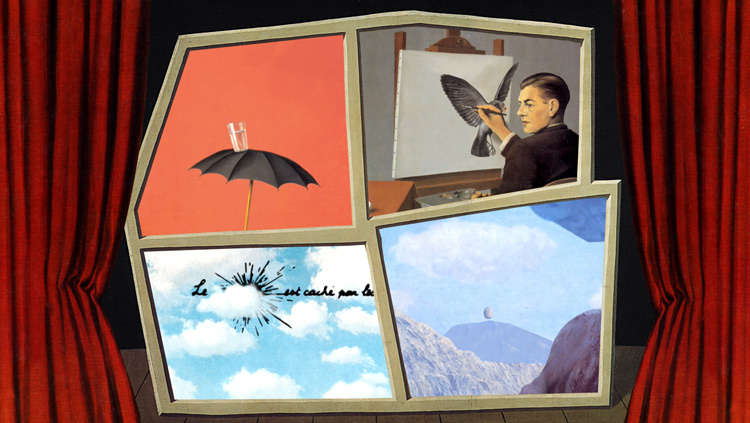
This is Not a Knob is an interactive video installation that incorporates a physical interface to explore the work of Surrealist artist Rene Magritte. By turning a giant knob the works of Magritte morph, change, and transition into new works and one another.

We were interested in creating a project that explored how a user experiences and interacts with a video installation. Inspired the exhibition ‘Mathematica” designed by Charles and Ray Eames, The Museum of Jurassic Technology, as well as the humorous work of Dadaist artists such as Marcel Duchamp, we were seeking evocative and entertaining ways to engage the viewer and provoke a better (and perhaps unconventional) understanding of the material. We intended this piece to function as a fun and informative installation piece that could potentially be used in a museum environment.

The project achieved this in three ways: 1) the use of a physical object (in this case, a giant knob) as interface. 2) the presentation of user controlled, looped video pieces. 3) the creation of an immersive space. Demo video. Video Loop One and Two.


Visual Designs
(graphics, photos, stills from movies, concept art, etc.)
wordscard
commdoor
elight
motionmap
roomrobot