About 10x10 (tenbyten.org)
10x10 is "an interactive exploration of words and pictures that define the time." Every
hour, 10x10 collects the top 100 words and 100 images from three news sources:
Reuters World News, BBC World and The New York Times International. The top 100
images and text are presented in a 10x10 grid. When you click a word or image, a
list of links to news articles with the particular words will appear. You can then choose
to click on one of the article links if you choose to read further.
10x10 is attempting to reinterpret the idea of the ways in which the news is read. The images
act as visual headlines. 10x10 believes "scanning a grid of pictures can be more intuitive
than reading headlines." It is 10x10's goal to bring the news to life using the affordances of the interactive web. They want readers to feel less distant from the world’s news.
Cross–Media Translation: Exhibition Design/Personal Interpretation
TOUCH . HEAR . SMELL . TASTE . SEE.
As humans, we are captured by the provocative.
On a superficial level, we are attracted to certain elements that are at the root of design – shape, color, patterns, size, texture and the list goes on. These are the things that catch our attention and cause us to pause, even if only for a split second.
Our ambitions and interests allow us to delve deeper, beyond our curious first impressions.
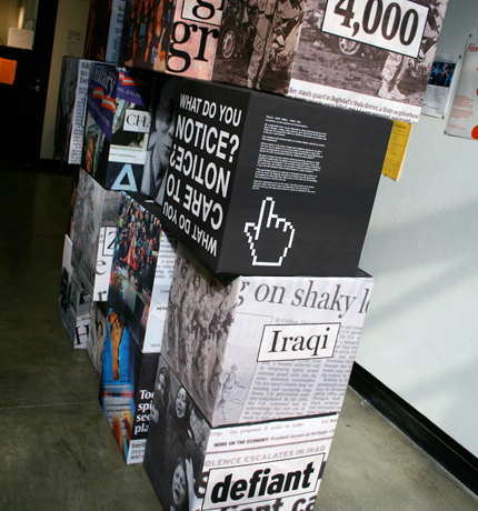
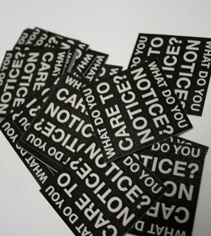
When it comes to the news, images and headlines scream for our attention. But do we
notice? Or do we just pass by because our eyes have grown accustomed to the facade of
a newspaper? Do we go elsewhere to search for truth and stories? And if so, where are
those places? We seek to know how the world is evolving around us, but are we really
reading in–depth about the going–ons around us nowadays? If not, why not? And how, as designers, can we think of alternative ways of looking at the news? How, as creatives, can
we better capture a viewer's curiosity in a way that will stimulate them to delve beyond a catchy headline?
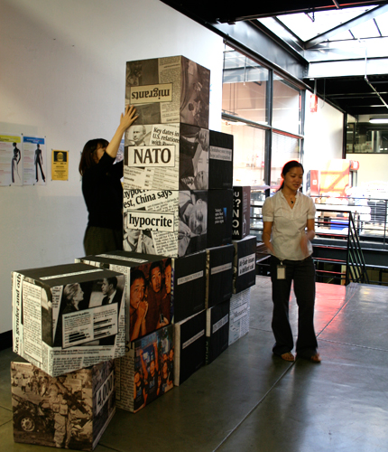
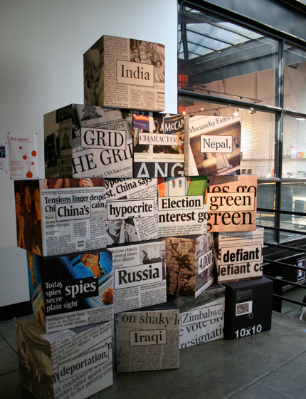
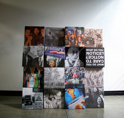
This experiential space was an attempt to reinterpret the way a viewer can enter the news. By adopting the goals of tenbyten.org, this space tried to translate the interaction that takes place on the web into an interaction that takes place in real life with you.
Each cube represents a story in the news. Each cube is interactive in the sense that a
participant
can rearrange the boxes and configure them in any way that they feel is
compelling or appealing, in a way that feels communicative of the particular message on
the box.