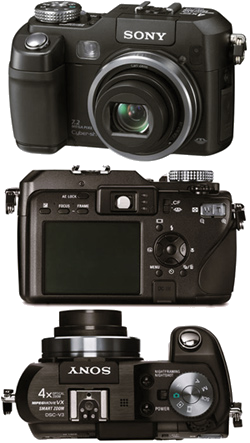
Sony Cyber-shot DSC-V3
(compared to the Nikon coolpix 5400)
Purpose
The a camera is a system for taking photos. Its principal challenge is managing a large number of options. We will focus on how the Sony manages these options well, and how the Nikon does it poorly.
Important options, those most involved with taking photos, have their own dedicated buttons. Other options are chosen from the two menu systems. There is a mode specific menu system for immediate options and a system wide menu system for general setup and management.
Interaction
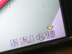
The user interacts with camera through buttons, knobs and an active matrix screen.
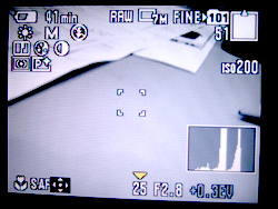
The Camera's screen is has a resolution of 123,000px arranged approximately 3x2 or 430px by 290px. There are also 4 LED indicator lights.
The camera has:
- 9 small buttons
- one group of direction buttons (5)
- “T/W” Buttons
- Mode Dial
- Jog Dial (+press in)
- 1 shutter button
- a media select switch
- a plethora of jacks.
What works well
Physical Design: The sony is built well. It feels substantial in your hands, requiring two hands to hold, but it is a nice weight. The mode select dial is stiff and makes a solid clicking sound when you make a selection.
The graphic design of the button icons is small, clean, and consistent (nearly every button on the nikon has a different typeface or color, for comparison). The buttons are laid out so that the right index finger is only used for the shutter and the other buttons are in easy reach of either thumb.
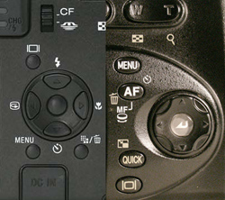
No Overloading: With the exception of the direction buttons, each button and dial controls just one set of options.
For example, the jog dial only controls the exposure settings. You press the dial in to move between shutter speed, apature, and overexposure and turn the dial to adjust those settings.
On the Nikon its jog dial controls the overexposure, manual focus, and is used sometimes (but not always) to change menu values.
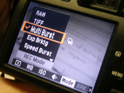
(Almost) Completely Consistent Menus: The menu system is nearly 100% consistent in how it works: side to side direction presses changes the category and up and down presses changes the value in that category. The only exception is in the setup menu.
In the nikon sometimes side to side controls options, sometimes values, and sometimes you use the job dial to changes settings and sometimes you don't. The sony’s consistency make it easy to learn and easy to predict how to get it to do what you want.
What Doesn't work well
Icons: While the icons are well designed and use industry standards, those standards are not always good. Both cameras had icons we could only understand from experience.
Clutter: The screen gets cluttered very quickly. They have done a good job of not obscuring the image but it is hard to find the icon you are looking for, or the setting you are adjusting.
Other: The self timer doesn't indicate remain times. The RAW shot-to-shot time is painfully slow. Icon doesn't have a hierarchy. All same size and most of them are white color.
Where is there room for inovation
The Sony does a good job of managing complexity. However, it is still complex. Is there away to keep a high level of control but with a simplier interface?
Nearly everything is controled by button presses, compared to anaolg cameras that use dials for everything. Is there a more intuative, or camera like way of controling those things?
How many built in features do you really need?
What if users can custumize default interface by themself?