

| Contacto |
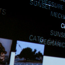
Due to the sheer volume of the data: over 20 HOURS of interviews and more than 4,000 individual entries from probes. ANALOG comparisons would never be sufficient with this amount of data. After transcribing and digitizing the data into a database expanding over columns and rows a deeper understanding of the connection between probes was reached, as well as the design challenge in visualization of such a vast amount of data. The numerous revisions in the design also became a dialogue in what we expected the database to give us, even when we couldn’t really imagine the thousands of different permutations that this tool could accomplish. There was a thin line between a navigation that would incite a more categorical and scripted view of the data and other which could render a random outcome. The final design addresses both of these preoccupations, as there is navigation through the 5 categories in which data was tagged: Voices of the Biosphere, Delight, Identity and place, as well as Personal and Global concerns. The screen is divided in three tiers, representing the TEEN, PARENT and EARTH’s voice. As the user reads nodes of data in the displayed window buttons on top indicate the categories in which the nodes in focus belong to. For example a certain node would have the Parent’s or Teenager’s Name, which probe the data comes from, and the one to three categories that this particular node was identified with. These words above each window also serve as buttons that the user can click on to navigate in the next node of that category. Users can therefore see the sequential progrssion of data through probes, through a participant in the study or through a category.
The third component of the Databse is the Earth’s Voice through the RSS feed of various websites which include BBC, the New York Times, National Geographic and other nature and news sites.

Super Studio
Design Research - PHOTO WALL
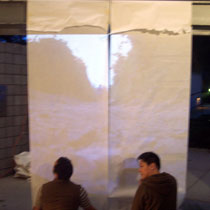
Super Studio
Project ROAM
Communication Design
Animation

Communication Design
Animation

Interactive Design
Adaptation of Einstein's Dream
Bespoke Future
Scenario Planning
Super Studio
Relational Database

Communication Design 2
Animations
Up Next Conference
Website and Animations